

What Maps Communicate: UN Resolution Challenges World Maps that Make Africa Look Smaller
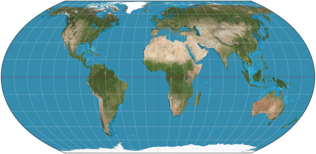
A UN resolution has renewed debate over how world maps distort Africa’s size, the legacy of the Mercator projection and the importance of equal-area maps.
Bertie Jacobs
For generations, millions of people have looked at world maps that make Africa appear smaller than it really is. A recent United Nations (UN) resolution has put that distortion under fresh scrutiny and sparked debate about how the world should be mapped.
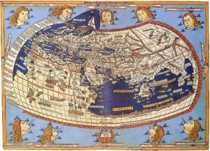
A medieval depiction of the Ecumene (1482, Johannes Schnitzer, engraver), constructed after the coordinates in Ptolemy’s Geography and using his second map projection
Dr Nisa Ayob, a senior lecturer in geography at the North-West University (NWU), says the debate goes beyond Africa’s size. It raises questions about how maps shape people’s view of the world and why cartographers must choose the right map for the right purpose.
At the heart of the debate is the Mercator projection. It dates back to the 16th century and was designed mainly for navigation. It preserves direction, which made it useful to sailors.
However, the projection enlarges land masses as they move closer to the poles. Africa lies largely around the Equator. It therefore does not receive the same visual enlargement as Europe, North America and Greenland. South America is also smaller on Mercator maps than its actual size.
“The problem is not that the Mercator projection is technically ‘wrong’; the problem is that it has been used far beyond the purpose for which it was designed,” says Dr Ayob.
Greenland provides a clear example. On a Mercator map, it can appear similar in size to Africa. In reality, Africa is about 14 times larger.
What maps communicate
Dr Ayob says this matters because maps do more than show locations.

Dr Ayob
“Maps are not only technical products; they are also powerful communication tools,” she says.
People rarely calculate the size of continents when looking at a map. Instead, they form a mental picture from what they see. Repeated exposure to distorted maps can therefore affect perceptions of Africa’s geographical scale and significance.
The UN resolution taken in September 2026 has drawn attention to equal-area projections, notably Equal Earth, an equal-area pseudo-cylindrical global map projection invented by Bojan Šavrič, Bernhard Jenny and Tom Patterson in 2018. These maps preserve the relative size of land masses.
The “Correct the Map” resolution, sponsored by Togo and backed by African Union (AU) members, passed with the support of 164 nations, including France and the United Kingdom. The United States was the only nation to vote against it and there were six abstentions. The AU’s 54 nations accepted the Equal Earth map in February 2026.
“Africa is not being ‘made bigger’ through these projections; rather, its size is being represented proportionally in relation to the rest of the world,” says Dr Ayob.
No map is perfect
She cautions, however, that no flat world map can provide a perfect picture of Earth. Every projection creates some distortion.
A map can preserve properties such as area, shape, distance or direction. It cannot preserve all of them at the same time.
Dr Ayob says cartographers should therefore select projections according to their purpose rather than simply following convention.
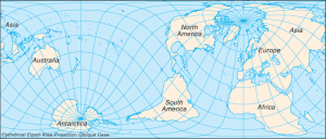
Cylindrical equal-area projection with oblique orientation
She believes the debate also creates an opportunity for South African schools and universities to review the maps they use.
Learners could compare Mercator and equal-area maps. They could then see how Africa, Europe, North America and Greenland change between projections. Such an exercise could help learners understand that maps are constructed representations of geographical reality, rather than perfect pictures of Earth.
Dr Ayob teaches geographical information systems and spatial analysis to undergraduate and postgraduate students. Her work helps students understand how spatial data, cartographic choices and map projections influence the way people interpret geographical information.
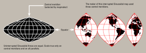
A sinusoidal projection shows relative sizes accurately, but grossly distorts shapes. Distortion can be reduced by “interrupting” the map.
“We should not simply replace one wall map with another without explanation,” she says.
Instead, Dr Ayob says students should learn to question the maps before them. They should ask what a projection preserves, what it distorts and whether it is suitable for the geographical question they are trying to answer.
Mr Bertie Jacobs is the Communication Specialist at North-West University’s Potchefstroom Campus
Related Posts
 Independence Marathon Turns to Blood Storage Gap in Maternal Health Drive
 Fine Spinners Injects Fresh USD5m Into Technology as Uganda Textile Maker Targets African, European Markets
 Equity Trade Mission Puts Uganda’s Manufacturing Capacity to Regional Test
 Uganda Seeks to Calm Coffee, Cocoa Markets as Global Prices Fluctuate on Positive Sentiment
 Uganda Green Entrepreneurs Set for Paris Visit as Stanbic-France Partnership Graduates 106
 Entebbe Airport Passenger Traffic Recovers in August but Remains Below 2025 Levels
Get business news delivered to you everyday
Latest News

What Maps Communicate: UN Resolution Challenges World Maps that Make Africa Look Smaller

Independence Marathon Turns to Blood Storage Gap in Maternal Health Drive

Fine Spinners Injects Fresh USD5m Into Technology as Uganda Textile Maker Targets African, European Markets

Equity Trade Mission Puts Uganda’s Manufacturing Capacity to Regional Test

Uganda Seeks to Calm Coffee, Cocoa Markets as Global Prices Fluctuate on Positive Sentiment

Uganda Green Entrepreneurs Set for Paris Visit as Stanbic-France Partnership Graduates 106

Nile Breweries, Next Media Renew Road Safety Push with Focus on Boda Boda Riders

Equity Bank Explores Value-Chain Financing to Support Zigoti Coffee Expansion

Uganda Breaks Ground on USD310m Kampala Fuel Terminal, Targets September 2028 Completion

Uganda Will Not Close Its 2.4-Million-Unit Housing Deficit with Ribbon-Cuttings in Kira